Memolect
Interactive Learning Flashcards
Product Overview
Memolect is a mobile-first flashcard learning application designed to help users retain knowledge effectively using scientifically-backed training techniques. With personalized memory modes, subject/flashcard creation, and spaced repetition logic, the app aims to serve learners ranging from students to professionals.
Our mission is to craft an intuitive, highly engaging, and flexible user experience that enhances memory retention across subjects and disciplines.

Problem Statement
- Learning apps often fall into two extremes: overly simplistic or too complex. Most flashcard tools don’t provide:
- Flexible control over memory modes (short-term vs long-term)
- Directional training (forward/backward)
- Audio contribution and community engagement
- Personalization at the flashcard level
- Memolect aims to bridge this gap by offering a smart, modular flashcard ecosystem with rich content interaction and robust configurability.
Research Objective
- Understand user needs and challenges in digital flashcard learning
- Identify behavior patterns, motivations, and frustrations
- Validate the demand for advanced training controls (timing, directionality)
- Benchmark against current competitors (Anki, Quizlet, Tinycards)
Brand Story
Who we are?
Memolect is an educational technology brand focusing on innovative, user-friendly learning tools such as flashcard apps for rapid, efficient learning.
Fast High-Quality Results
Deliver practical outcomes swiftly, without sacrificing depth or effectiveness.
Quality-Driven Learning
Enhance retention by focusing on high-impact content, ensuring efficient progress toward learners’ goals.
Efficiency
Deliver maximum value with minimal daily effort.
Focus Over Clutter
Deliver practical outcomes swiftly, without sacrificing depth or effectiveness.
Accessibility
Enhance retention by focusing on high-impact content, ensuring efficient progress toward learners’ goals.
Consistency
Deliver maximum value with minimal daily effort.
Empowering Learners
Provide the right tools and support to promote self-learning and boost confidence.
Memolect
Apps Logo Icon
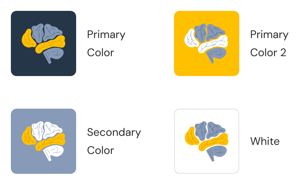
When designing app icons, it's essential to consider the diverse range of colors that can appeal to various devices and users.
Ensuring visibility across different settings. Meanwhile, tablets might benefit from larger, more detailed icons that showcase the app's functionality.
Ultimately, the key is to resonate with your target audience while ensuring that the icon remains recognizable and appealing across all platforms.
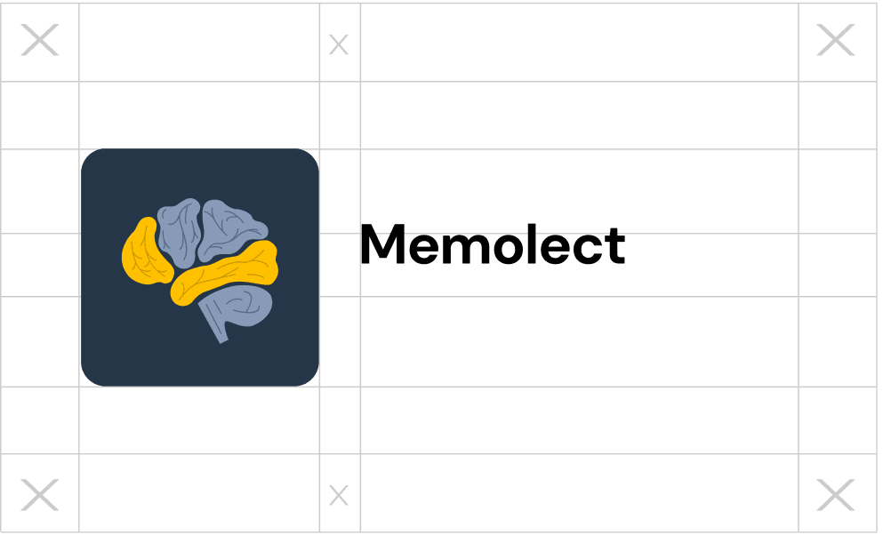
Logo Clear Space
When designing your brand, it's crucial to adhere to specific guidelines that dictate the appropriate spacing and sizing for both the emblem and the brand name. This ensures that your logo is not only visually appealing but also maintains its integrity across various applications. Proper spacing allows the emblem and text to breathe, creating a harmonious balance that enhances brand recognition.
Style Guide
Color Palette
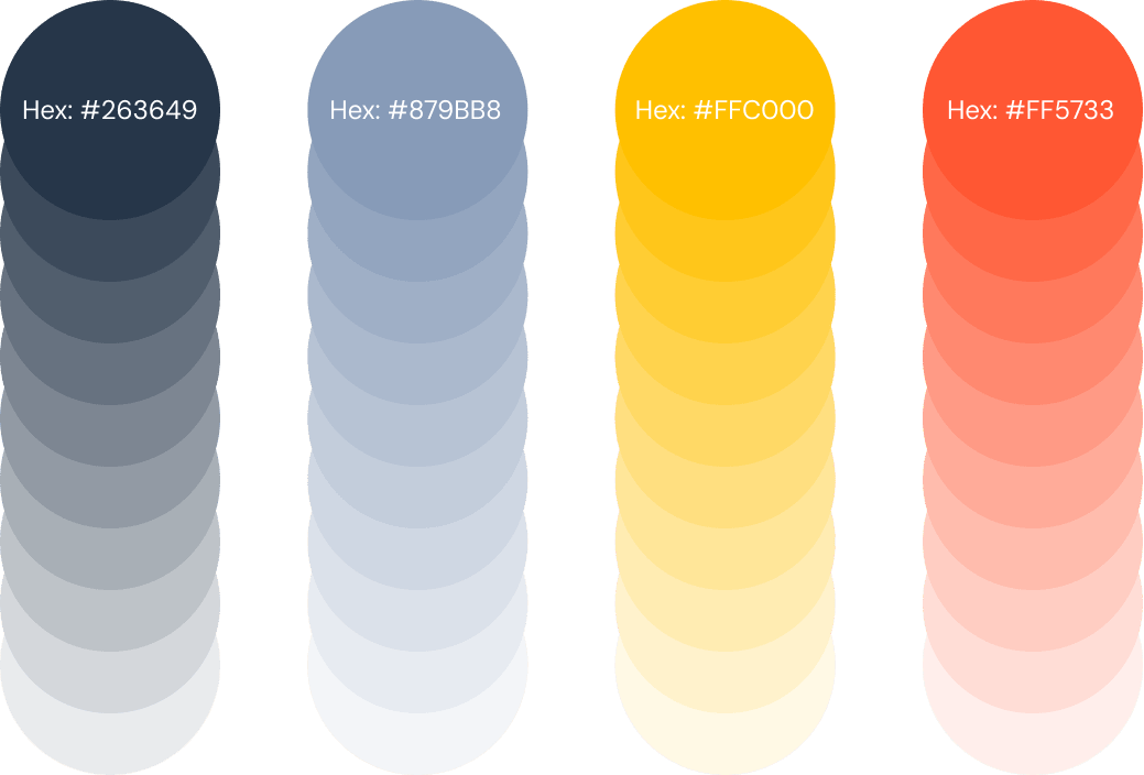
In app design, color choice is crucial for establishing a brand's identity. Colors evoke emotions and create a visual language that users connect with, while consistent usage across platforms fosters trust and loyalty.
A well-defined color palette enhances user experience by making interfaces intuitive and engaging. By maintaining a cohesive color scheme, brands effectively communicate their values, helping users identify and relate to the app.
Typography
DM Sans
This different font sizes will be used throughout the application to maintain pixel perfect design and clean style sheet.

Regular Text
Lorem ipsum dolor sit amet, consectetuer adipiscing elit, sed diam nonummy nibh euismod. Lorem ipsum dolor sit amet, consectetuer.
Medium Body Text
Lorem ipsum dolor sit amet, consectetuer adipiscing elit, sed diam nonummy nibh euismod. Lorem ipsum dolor sit amet, consectetuer.
Semi-Bold Title Text
Lorem ipsum dolor sit amet, consectetuer adipiscing elit, sed diam nonummy nibh euismod. Lorem ipsum dolor sit amet, consectetuer.
Text Hierarchy
Regular Text
16px | 1 rem
AaBbCcDdEeFfGg HhIiJjKkLlMmNnOo PpQqRrSsTtUuVv WwXxYyZz
1234567893
(@#$^*%)
Medium Body Text
16px | 1 rem
AaBbCcDdEeFfGg HhIiJjKkLlMmNnOo PpQqRrSsTtUuVv WwXxYyZz
1234567893
(@#$^*%)
Semi-Bold Title Text
16px | 1 rem
AaBbCcDdEeFfGg HhIiJjKkLlMmNnOo PpQqRrSsTtUuVv WwXxYyZz
1234567893
(@#$^*%)
High Fidelity Screen
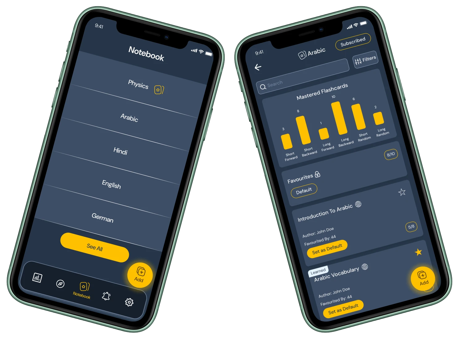
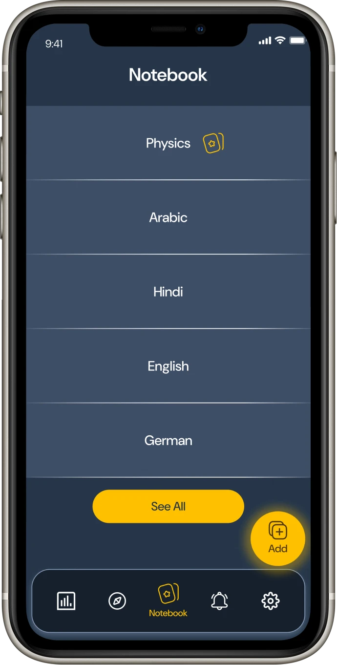
The Notebook screen acts as the main launch point of Memolect, providing quick access to the user's chosen subjects. Up to five preferred subjects are displayed here for effortless navigation and focused learning. Each subject comes with a default learning mode, which can be customized according to the user's preference — ensuring a personalized and consistent study experience from the very first interaction.
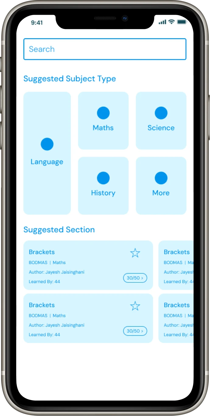
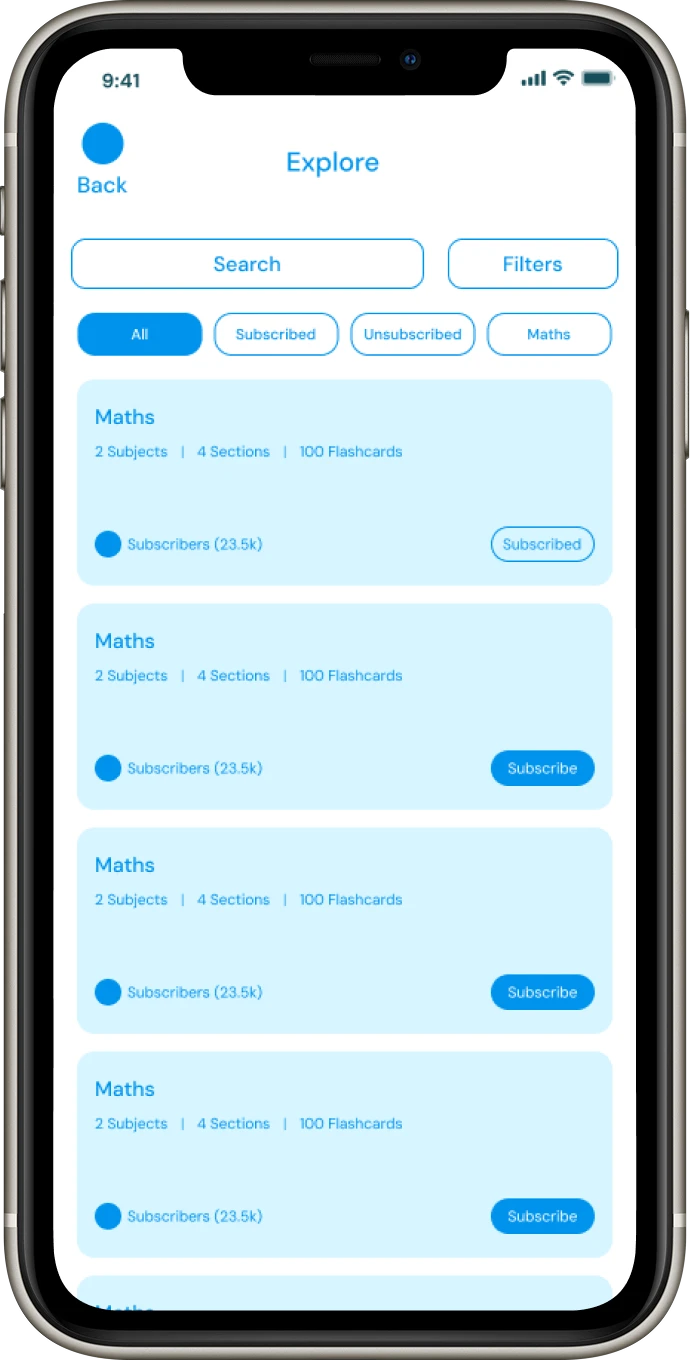
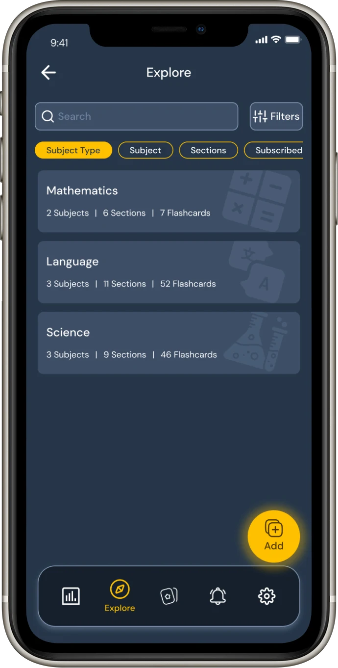
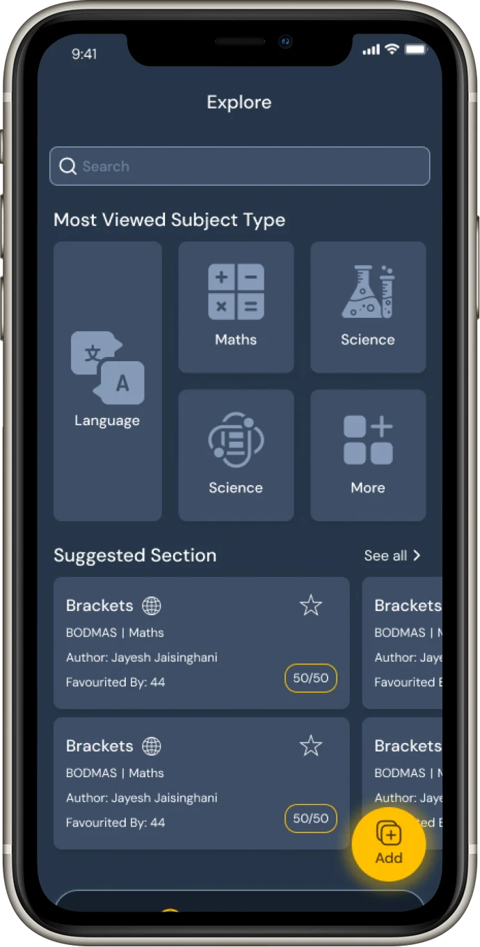
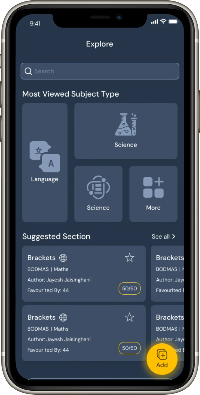
The Explore screen enables users to browse and discover new learning content organized by categories such as subject type, sections, or subscriptions. It offers a structured yet flexible way to navigate through flashcards, making it easy to find relevant material.
A clean search bar and filter options simplify exploration, while the categorized layout promotes quick decision-making. The bright yellow accents guide user attention to interactive actions, maintaining consistency across the app's visual language.
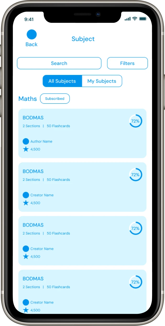
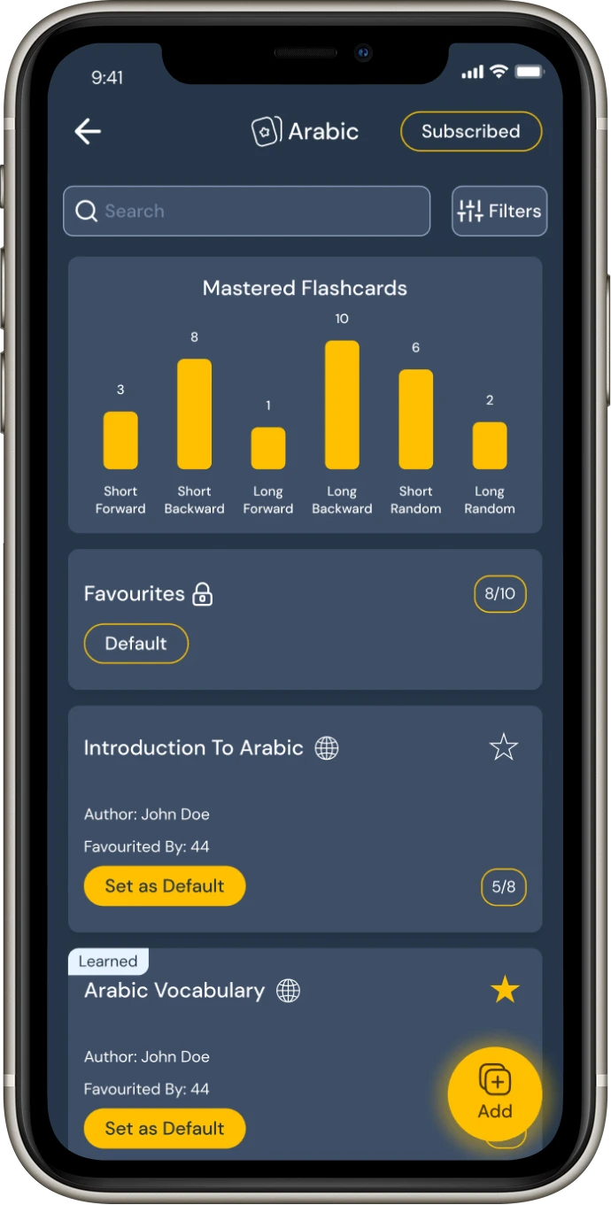
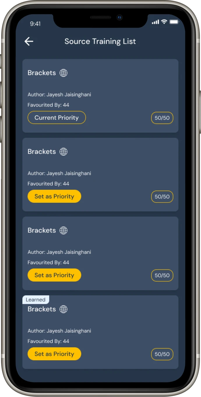
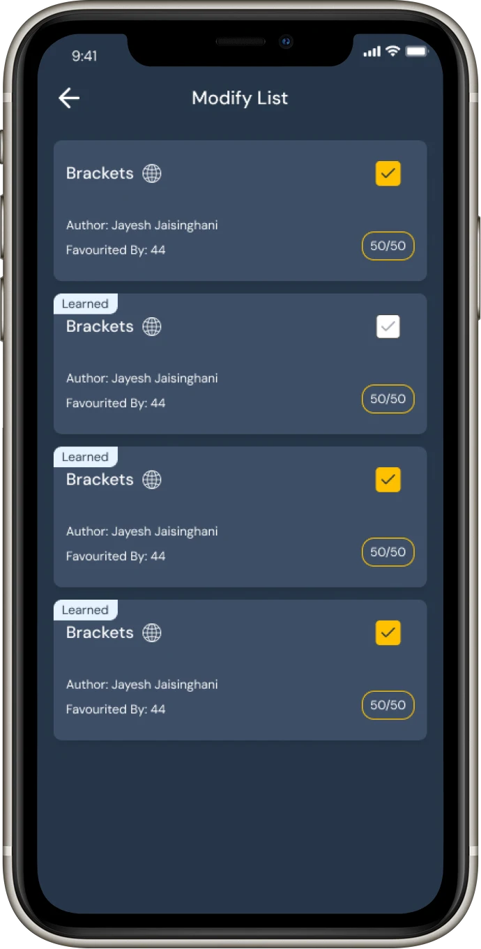
The Subject Overview screen provides an in-depth view of the user's progress within a specific subject. It highlights mastered flashcards through detailed analytics, helping learners track their improvement across different learning modes.
Users can view available sections, mark favorites, and set a preferred section as the default for streamlined access. The interface maintains clarity through structured information hierarchy — balancing progress insights, personalization options, and quick navigation for an efficient learning experience.
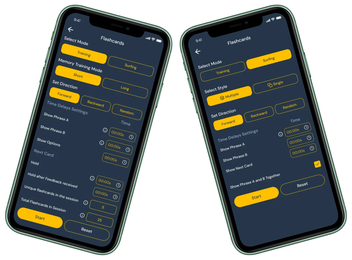
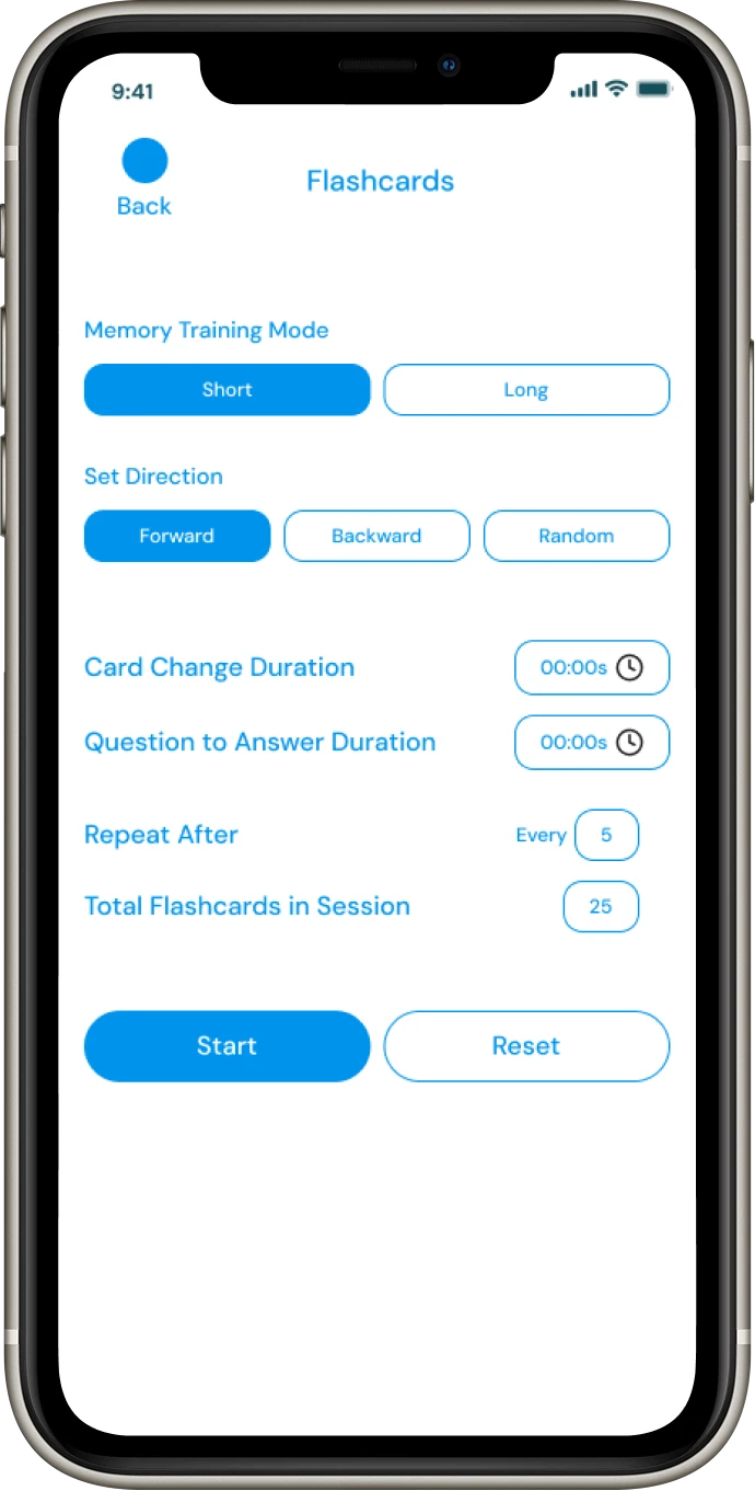
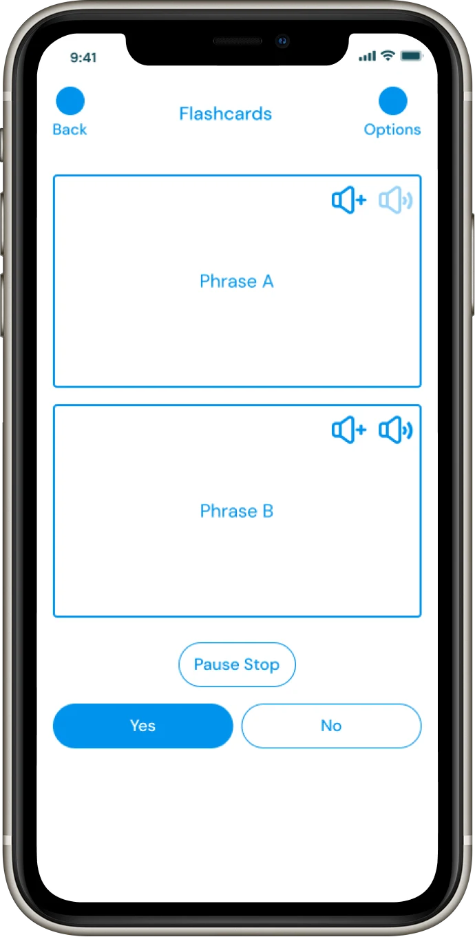
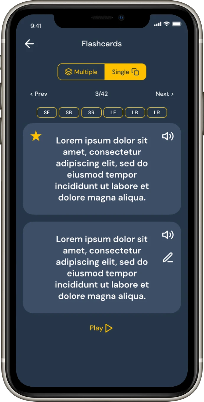
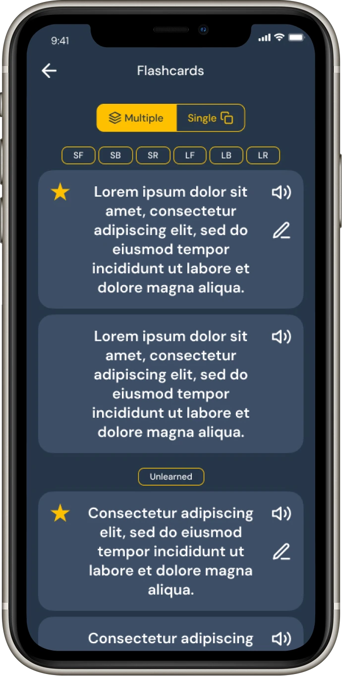
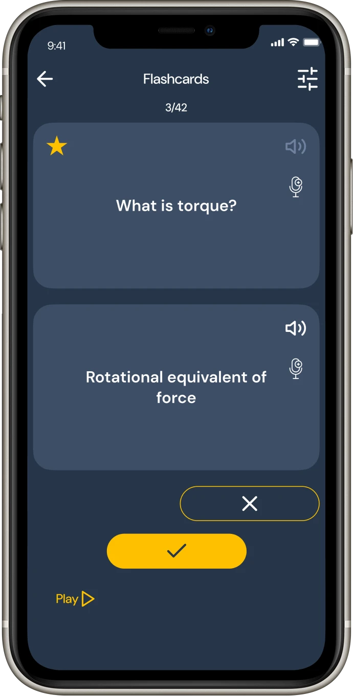
The Flashcard Learning screen is the core interaction space of Memolect, designed for focused and engaging study sessions. Each flashcard is displayed individually to enhance retention and recall through active interaction.
Users can choose between two distinct modes — Surfing, for casual browsing and quick review, and Training, for focused practice and mastery. The clean, minimal layout with subtle transitions ensures an uninterrupted and immersive learning experience.
Other Screens
Wireframes